A font name identifies a specific typeface or font style used in digital and print design. Knowing the correct font name helps designers, businesses, students, and content creators maintain brand consistency, improve readability, and create professional-looking documents.
Whether you are designing a logo, creating a website, editing a presentation, or identifying text from an image, understanding font names makes selecting and managing typography much easier.
What Is a Font Name?
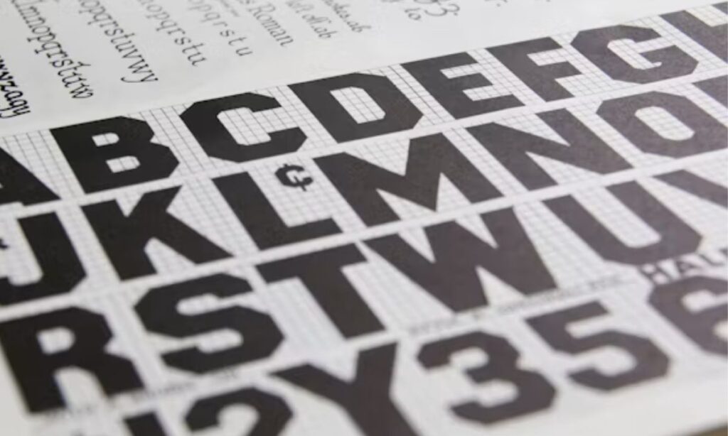
A font name is the official name assigned to a font by its creator or foundry. It distinguishes one font from another and helps users install, identify, and use the correct typeface.
For example:
- Arial
- Helvetica
- Times New Roman
- Roboto
- Calibri
- Georgia
- Open Sans
- Montserrat
- Lato
- Poppins
Each font name represents a unique design with its own letter shapes, spacing, and visual characteristics.
Why Is Knowing a Font Name Important?
Knowing the correct font name offers several benefits.
- Maintains consistent branding.
- Improves document readability.
- Simplifies collaboration among designers.
- Helps recreate existing designs.
- Makes font installation easier.
- Ensures typography consistency across platforms.
- Saves time during design projects.
Businesses often use the same font name across websites, advertisements, presentations, and marketing materials to create a recognizable visual identity.
Font vs Typeface: What Is the Difference?
Many people use the terms interchangeably, but they have different meanings.
| Typeface | Font |
| A complete design family | A specific style within the family |
| Example: Helvetica | Example: Helvetica Bold 14 pt |
| Defines overall letter design | Defines size, weight, and style |
| Includes multiple variants | Represents one variation |
Today, most users simply refer to both as fonts.
Common Types of Fonts
Different font categories serve different design purposes.
Serif Fonts
Serif fonts include small decorative strokes at the ends of letters.
Examples:
- Times New Roman
- Georgia
- Garamond
- Baskerville
Best for:
- Books
- Newspapers
- Academic documents
- Formal reports
Sans Serif Fonts
Sans serif fonts have clean lines without decorative strokes.
Examples:
- Arial
- Helvetica
- Roboto
- Open Sans
- Calibri
Best for:
- Websites
- Mobile apps
- Presentations
- Business documents
Script Fonts
Script fonts imitate handwriting or calligraphy.
Examples include:
- Pacifico
- Lobster
- Allura
- Dancing Script
Best for:
- Invitations
- Wedding cards
- Logos
- Creative branding
Display Fonts
Display fonts are decorative and designed for headlines.
Examples:
- Bebas Neue
- Impact
- Anton
- Cinzel
Best for:
- Posters
- Advertisements
- Headlines
- Banner designs
Monospace Fonts
Monospace fonts assign equal width to every character.
Examples:
- Courier New
- Consolas
- Source Code Pro
- Monaco
Best for:
- Coding
- Programming
- Technical documents
- Terminal applications
How to Identify a Font Name
Finding an unknown font name has become easier thanks to modern tools.
Popular methods include:
Upload an Image
Several online tools can analyze text inside images and suggest the closest font names.
Popular tools include:
- WhatTheFont
- Font Squirrel Matcherator
- Adobe Fonts Visual Search
Browser Inspection
You can inspect a webpage using browser developer tools to identify the font name used on a website.
Graphic Design Software
Applications such as Adobe Photoshop, Illustrator, and Canva often display the font name when text layers are selected.
Document Properties
Microsoft Word, Google Docs, and presentation software display the active font name in the formatting toolbar.
Read more Letter Fonts: 1000+ Free Styles to Copy & Paste
Popular Font Names for Modern Design
Many designers consistently choose these fonts.
| Font Name | Category | Best Use |
| Roboto | Sans Serif | Websites |
| Open Sans | Sans Serif | Blogs |
| Poppins | Sans Serif | UI Design |
| Montserrat | Sans Serif | Branding |
| Lato | Sans Serif | Business |
| Georgia | Serif | Articles |
| Merriweather | Serif | Reading |
| Playfair Display | Serif | Luxury Brands |
| Bebas Neue | Display | Headlines |
| Pacifico | Script | Creative Projects |
How to Choose the Right Font Name
Choosing the right font depends on your project’s goals.
Consider these factors:
Readability
Choose fonts that remain easy to read across different screen sizes and printed materials.
Brand Personality
A luxury brand may prefer elegant serif fonts, while a technology company often selects modern sans serif fonts.
Compatibility
Ensure the font works on different operating systems and browsers.
Licensing
Some fonts are free for commercial use, while others require a license.
Always review licensing terms before using a font in commercial projects.
Free Font Resources
Several trusted websites provide free fonts.
Popular resources include:
- Google Fonts
- Font Squirrel
- Adobe Fonts
- DaFont
- FontSpace
Google Fonts remains one of the most popular choices because it offers open-source fonts optimized for websites.
Best Font Names for Websites
Website typography should focus on readability and performance.
Popular website fonts include:
- Roboto
- Open Sans
- Lato
- Poppins
- Inter
- Nunito
- Source Sans Pro
These fonts display well on desktop computers, tablets, and smartphones.
Best Font Names for Logos
Logo fonts depend on brand identity.
Popular logo fonts include:
- Futura
- Gotham
- Helvetica
- Montserrat
- Avenir
- Garamond
- Bodoni
A memorable logo combines typography with simplicity and consistency.
Best Font Names for Business Documents
Professional documents benefit from clean typography.
Recommended fonts:
- Calibri
- Arial
- Times New Roman
- Cambria
- Georgia
- Aptos
These fonts offer excellent readability for reports, contracts, and presentations.
Tips for Using Fonts Effectively
Good typography improves user experience.
Follow these best practices:
- Use no more than two or three fonts in one design.
- Maintain consistent font sizes.
- Create visual hierarchy with headings.
- Ensure sufficient contrast between text and background.
- Use adequate line spacing.
- Avoid overly decorative fonts for long paragraphs.
- Test fonts on different devices.
Simple typography often produces more professional results than using many decorative fonts together.
Common Mistakes When Choosing a Font Name
Many beginners make avoidable typography mistakes.
Common errors include:
- Using too many fonts.
- Ignoring readability.
- Choosing fonts without checking licenses.
- Using decorative fonts for body text.
- Mixing incompatible font styles.
- Forgetting mobile responsiveness.
- Selecting fonts that do not support required languages.
Avoiding these mistakes creates cleaner and more effective designs.
Future Trends in Font Design
Typography continues to evolve with digital technology.
Current trends include:
- Variable fonts
- Responsive typography
- Accessible font design
- Minimalist sans serif fonts
- AI-assisted font recognition
- Improved multilingual font support
These innovations improve website performance, accessibility, and user experience.
Final Thoughts
A font name is much more than a label. It identifies the typography that shapes how readers perceive documents, websites, logos, and digital content. Choosing the right font name enhances readability, strengthens brand identity, and creates a polished visual experience. By understanding font categories, identification methods, licensing, and typography best practices, you can confidently select fonts that suit any personal or professional project.
Frequently Asked Questions (FAQs)
1. What is a font name?
A font name is the official name assigned to a specific typeface or font style. It helps users identify, install, and consistently use the correct typography across digital and print projects.
2. How can I identify a font name from an image?
You can upload an image to tools like WhatTheFont, Adobe Fonts Visual Search, or Font Squirrel Matcherator. These services analyze lettering and suggest matching font names within seconds.
3. Which font names are best for websites?
Roboto, Open Sans, Inter, Lato, Poppins, and Montserrat are popular website fonts because they provide excellent readability, modern appearance, responsive performance, and broad compatibility across browsers and devices.
4. Are all font names free to use?
No. Some fonts require commercial licenses, while others are free. Always review the font’s licensing terms before using it in business, branding, marketing, or commercial design projects.
5. What is the difference between a font and a typeface?
A typeface is the complete design family, while a font is one specific variation, such as bold, italic, or a particular size within that typeface family.
Conclusion
Font names are more than just simple labels — they shape the personality of every design, website, logo, and document. Whether you’re a student trying to make your presentation look professional, a designer searching for the perfect brand identity, or someone who just wants to make their social media bio stand out, knowing the right font name instantly makes your work look polished and consistent. Now that you understand the difference between serif, sans serif, script, and display fonts, choosing the right font will feel a lot easier than before.
So the next time you spot a beautiful font on a website or come across an unknown typeface in an image, don’t worry — you now have all the knowledge you need. Try out free tools, pick fonts that match your project, and give your typography the confidence every great design deserves. Happy designing! 🎨

Barbie | Expert on tool sites delivering fast, high-quality services with top performance, creativity, and professional results clients trust every time.